Adding Opaque Color to Paper Sculpture:
In the last blog post, I talked about using painted textures to add visual interest to your paper sculpture. This can be done on a whole shape basis, to change the color/pattern of the piece.
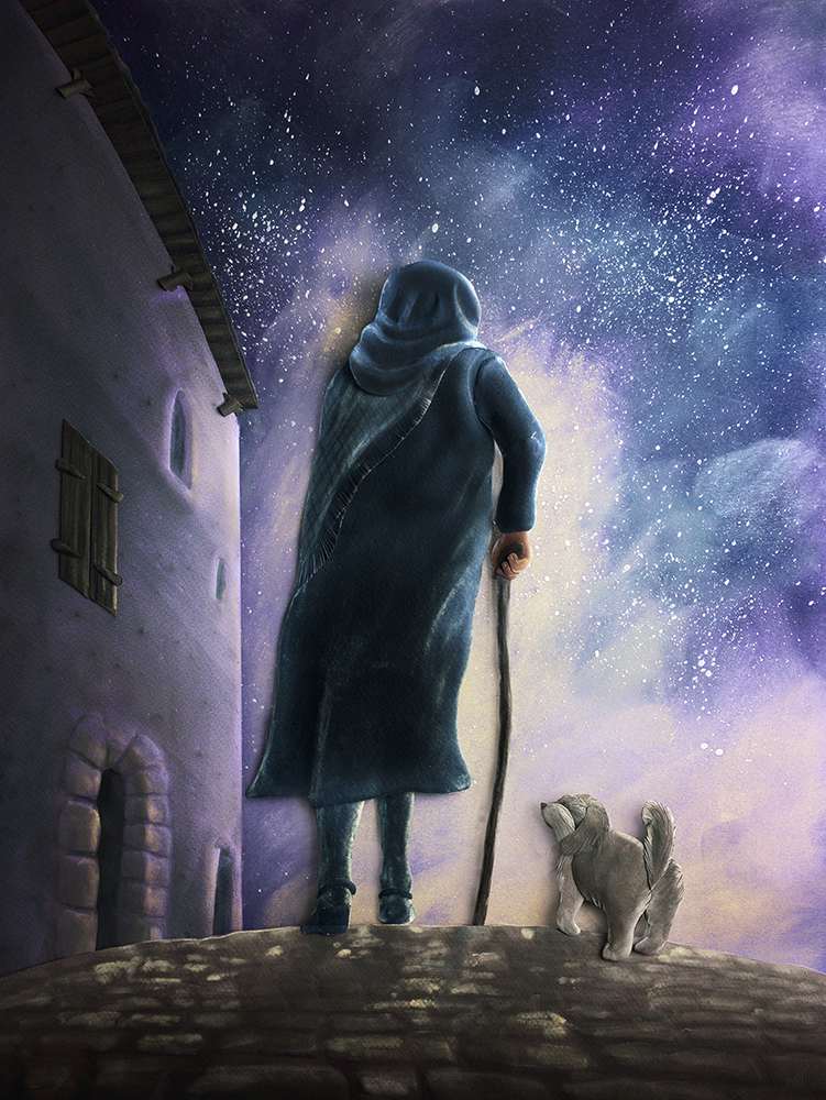
You can also add selective areas of color with opaque pastel and pencil mediums to add detail, and boost color and shape. For a more graphic pieces, I would probably add very little pastel to the piece. Other pieces, like “The Night Traveler” (at left) rely on a large amount of added opaque color.
One artist who does a wonderful job of selectively adding areas of color to enhance the dimensionality of her paper sculpture artwork is Karin Arruda. She is best followed on Instagram where she regularly posts her work @karin_arruda
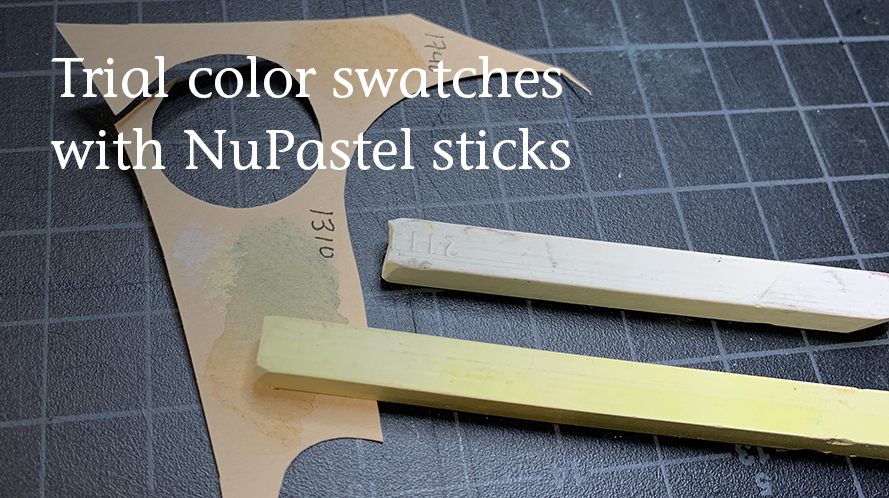
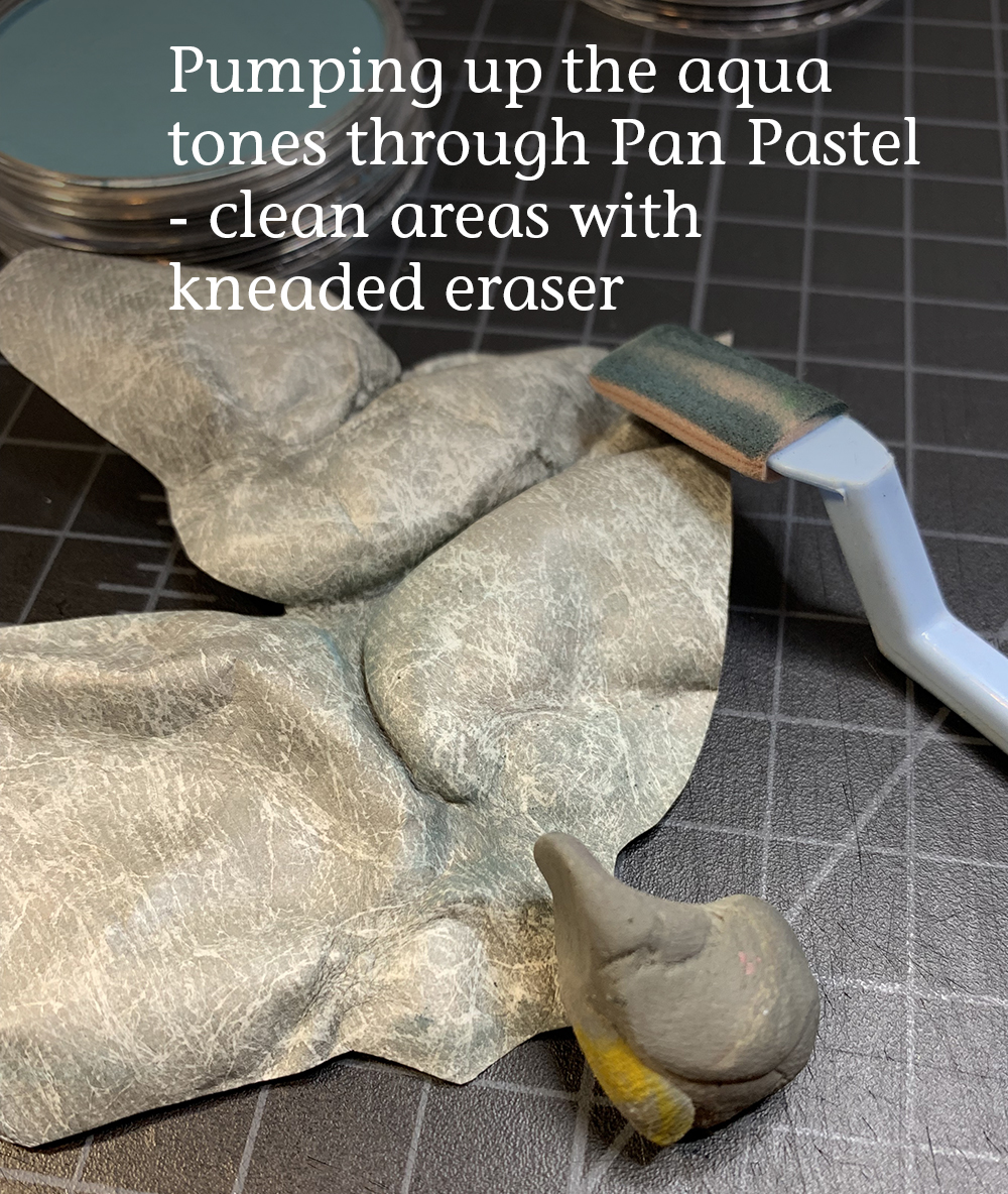
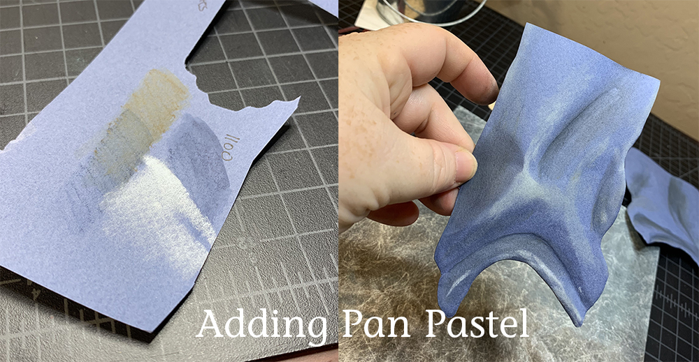
I use the paper swatches I created previously with the ink media and make similar trials of the pastel colors before applying to the sculpture pieces. Pastel is a very forgiving media, however, so I can step back color or clean up areas easily with a kneaded eraser.
Recommended Pastel Supplies:
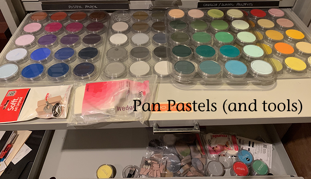
PAN PASTELS
The media I use most often as an opaque addition is Pan Pastels. I love these so much, because I can blend an infinite spectrum of colors, erase, add, and even paint with them. Again, this is something that requires a large initial outlay but will last forever (unless you drop them - there is no coming back from that!). I bought a few to play with, and then waited till there was a sale where I could purchase the large set at ½ price. I have purchased the Pan Pastel blender/applicator sponges, but I don’t recommend them. They are expensive, and I have not had success washing/reusing them. Instead, I buy inexpensive makeup sponges at the dollar store. I keep the sides clean for the specific colors I’m using, and then throw them out when the piece is completed.
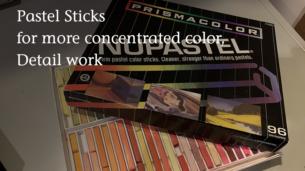
NUPASTELS
I also use Nupastel Sticks for more fine work with stronger colors. These can be blended into the Pan Pastel.
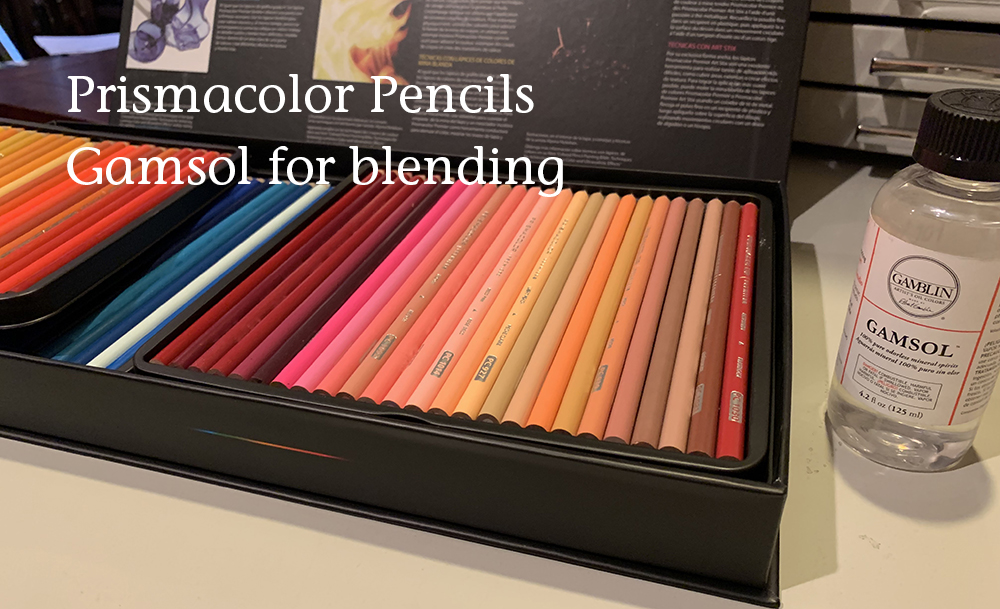
COLORED PENCILS
Although I haven’t played with it much in the past, I am looking to work more in colored pencils for detail work in my paper sculpture. Colored pencil artists I've asked have recommended "Gamsol" as a blender that is still acid-free and archival (unlike baby oil). It didn't seem to work with pastels in my experiments.
WAYS TO USE PASTEL IN PAPER SCULPTURE:
Pastel in the background:

One challenge with paper sculpture is playing with hard/soft edges in your work to help direct the eye. Something I’ve tried is creating the background in pastel, achieving an effect analogous to “bokeh” in photography (sharp foreground/blurry background).
In the “Giraffe Breakfast” piece (at left), I worked the background entirely in pan pastel.
(Note: I sometimes have trouble finding large enough single sheets of paper for my background piece, so I will piece the paper together in a way that I know I will be able to later hide through layers on top. The seam is very visible at the pastel stage. Also, the new sheets of Colorplan paper through Talas.com are twice the size of standard drawing sheets, so I don’t foresee having this issue in the future 😊)
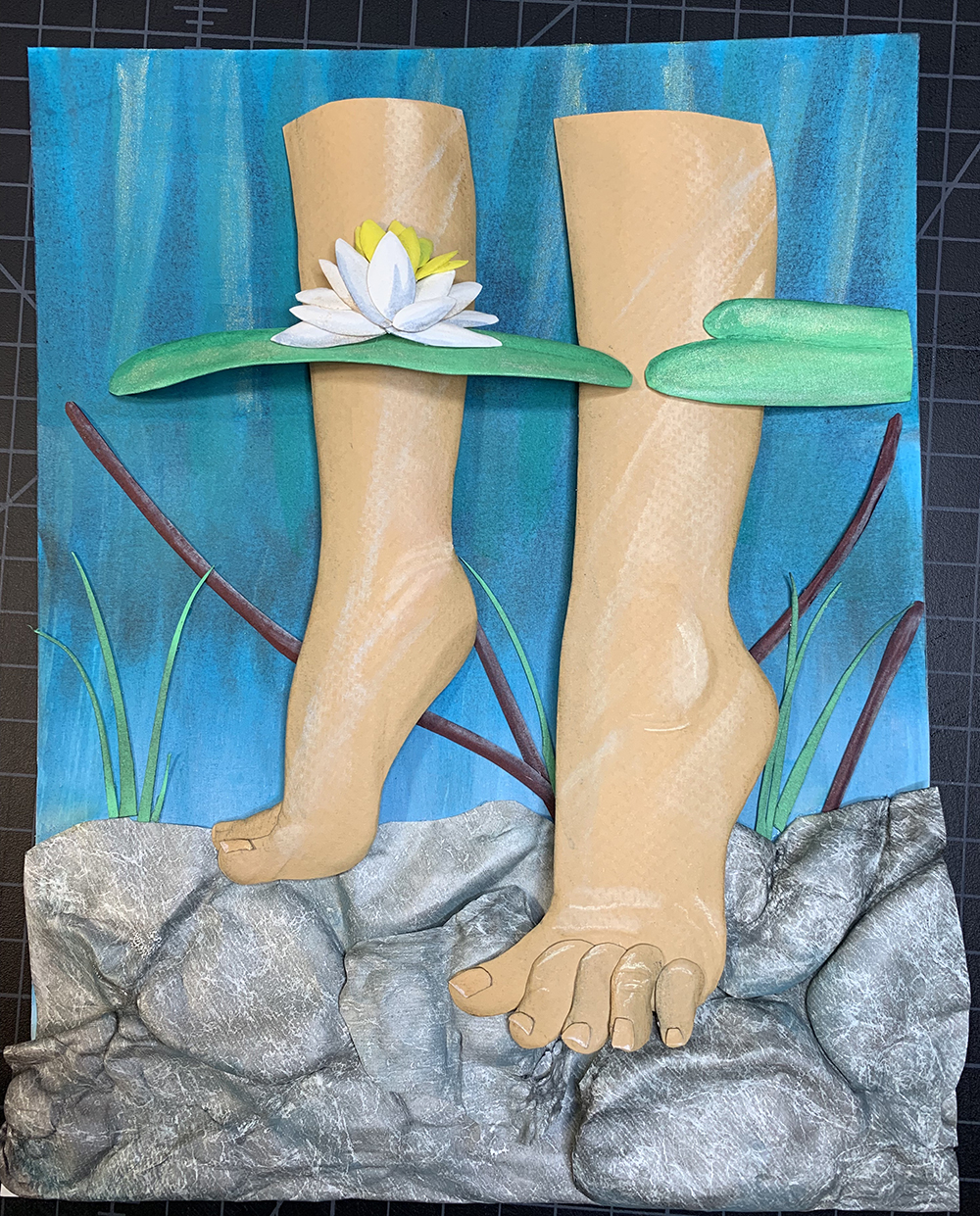
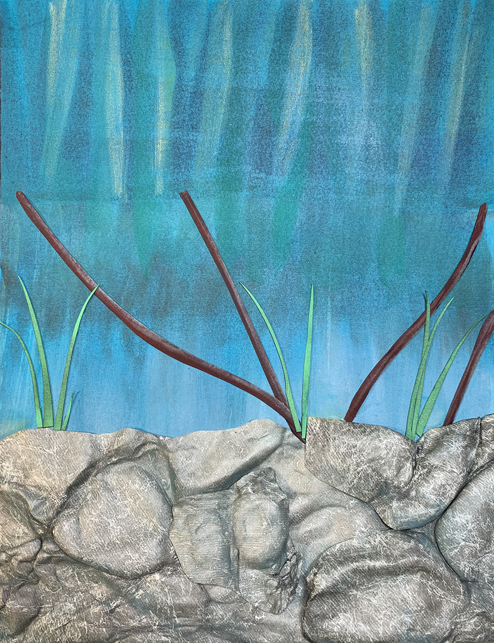
I used the pan pastel to add more aqua tones in the shadows of the river rocks for the “Star Maiden”.
The pan pastel also helps me to break up the strong blue background of the “Star Maiden” background. I’m not dulling the blue too much because I think it will recede a lot with an overlay of films at a later stage.
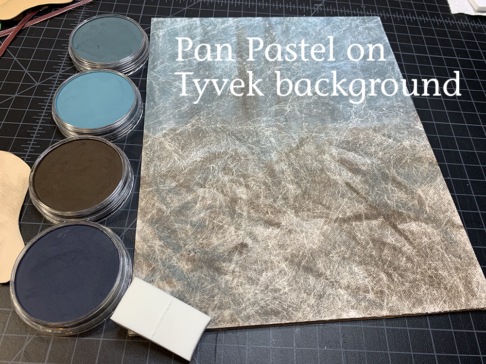
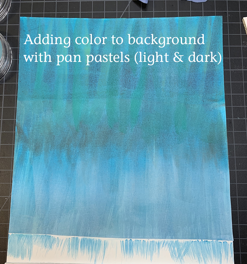
The pan pastel worked wonderfully on the Tyvek background, although I wish I had gone darker with the inks I laid down initially.
Pastel to Enhance Highlights/Shadows, or to add Local Color:
Although much of the highlights/shadows in paper sculpture come from the actual physical shapes and dimensions of the paper sculpture, you can also enhance the highlights and shadows through pastel. This can also be beneficial if you want to highlight light direction or effects. I tend to work too strong initially, and then blend or erase back once I have the final image more fully assembled.
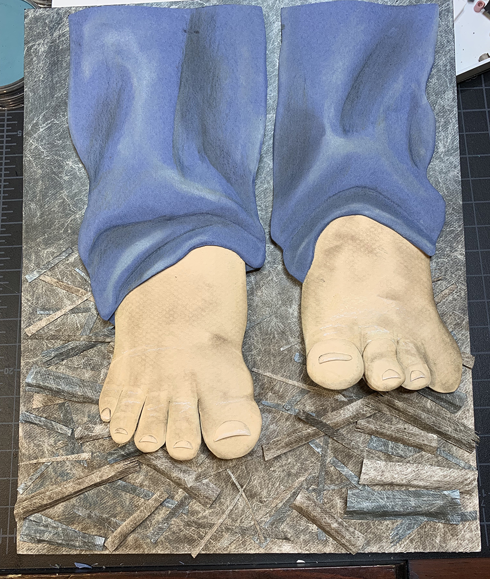
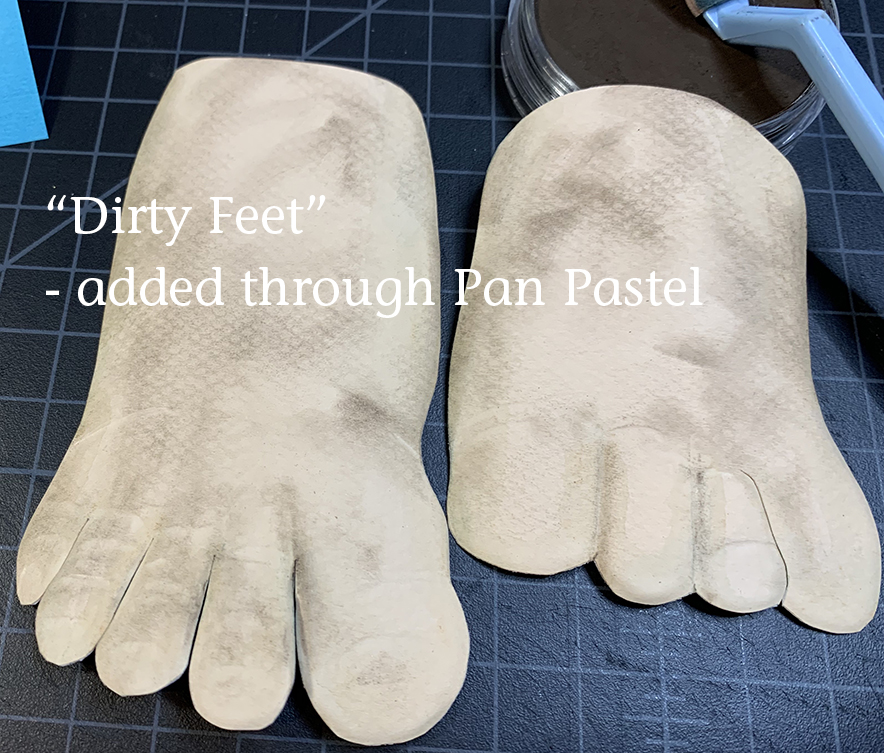
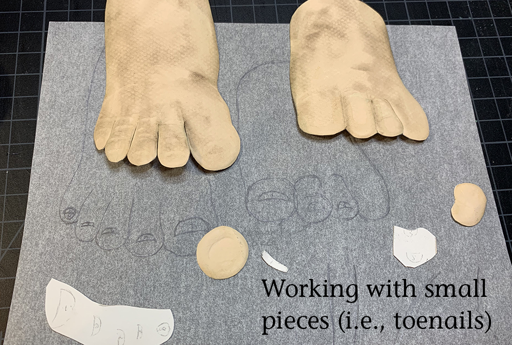
On the feet of “The Spirit in the Bottle” piece, I deliberately used the pan pastel to add unblended local color. The boy is walking barefoot through a forest – his feet would not be clean.
Adding Pastel to Enhance Paper Texture:

One happy accident I discovered recently is using pastel as a method of highlighting textures I’ve embossed or scratched into the paper. Depending on if the paper is raised up or down, or scratched, the pastel leaves the texture lighter or darker in the image. This works wonderfully for fur textures.
Pastel for Decorative Effects:
There are also some metallic pan pastels which I have played with in the “above water” portion of the “Star Maiden” background. I did not photograph the piece in such a way to display the effect well, but I plan on adding more at the final stage as it gives a lovely, shimmery “magical” feel to the paper.
FIXING THE PASTEL:
I will fix the pastel with a permanent spray fix (generally Krylon Crystal Clear) at the end of the entire process of building the paper sculpture. This allows me to make corrections at later stages if color/lighting seems wrong when the piece is put together. Waiting to fix the pastel, however, also means that the pieces are quite messy (the pastel will rub off) to work with going forward. I usually have a box of baby wipes close by to clean my fingers as a go. (Another reason why shaping/forming comes BEFORE adding pastel).
NOTE: I only spray the pieces where I’ve used pastel – it is not necessary on paper only.
Archival Tip: Please use an appropriate fixative for your work. I saw a professional (!) illustration company give the advice recently on twitter that “Hairspray is a great, quick fix for your illustration”. DO NOT DO THIS! This was something I did in high school, because I didn’t know better, and within 10 years all those drawings were yellowed. I try to follow archival methods whereever possible now because you never know where your art will end up.
PROCESS:
Although these blogs posts show a linear progression through the artwork, in reality there is much more back and forth. Particularly with tiny pieces, I will do the cutting, coloring, embossing and gluing all in one sitting to lessen the likelihood of pieces getting lost.
Final Embossed & Colorized Backgrounds