
Working with Colored Papers
- joninemeth
- Oct 25, 2022
- 6 min read
(To see #Slowvember work only, scroll to images in the middle of the post.)

My goal is to work in children’s books, so limiting my palette to only white paper is not realistic. In some stories, color not only enhances but takes on an integral part of the narrative. Think of “Little Red Riding Hood” – how would you illustrate this story without the color red? You could do a limited palette, even of only white with red – but arguably, you would lose an important element if you limited yourself to white paper.
Thus, colored papers are an important part of how I work. Fortunately, there is a huge range of commercially available colored papers – usually marketed as pastel or charcoal papers. Unfortunately, they will never be able to match all the colors we see or want to use in our images. (Reproduction/printing limitations will also come into play down the road, but I always want to start with certain colors as a base).
Colored Paper Manufacturers:
Here are some of the industry standard papers I use – I work across various manufacturers to get a wider variety of colors. You want to purchase the lighter weight version and create your own 2-ply, just as with the white paper.
All of these listings are at Dickblick.com – not because I get any sort of kickback, but because it’s the only online store I’ve found that will sell you single sheets of single colors.
Canson Mi-Tientes – probably the most readily available, with a wide range of color. Use the 98 lb paper
Canson Colorline - again, buy the 150 gsm (92 lb)
Strathmore 500 Charcoal – these are very lightweight and need to be backed with a heavier paper.
I recently found a new (to me) line of colored papers – Colorplan by Legion. You can purchase a swatchbook at https://legionpaper.com/samples/ and the actual papers at : https://www.talasonline.com/Colorplan-Paper
I was happy to find that I could order a physical copy of a swatch book, which allowed me to see which colors would extend my existing range. Unfortunately, I can only find them sold online, and the smallest multiple was quantities of 5. You want the 135 gsm paper weight. But, because I had a printed physical swatch book, I feel confident that they are not duplicate colors, or are colors I know I’ve wished I had.
For example, black is never black (just like white is never only white). There was a lovely blue-black that I have been trying to replace for months. On the Talas color chart, the “Imperial Blue” is actually this blue-black I’ve been trying to find. 😊
Building and Organizing a Library of Colored Paper Samples
Building your initial library of paper is expensive – there is no getting around it. If you live close to where you can go to a physical art store, you could progressively purchase papers for individual projects. When you order online (and even in the physical store) there is usually a discount for purchasing more than 5+ papers at a time. If you can order the physical color chart (paper swatch not printed), it will save you a lot of money initially, although you’ll have to account for shipping times when you want to purchase paper. (You may be able to buy the swatch books by contacting Dickblick.com directly).
If you can afford the initial outlay however, having an in-stock paper library will give you the most flexibility, and once established, is much less expensive to replenish.

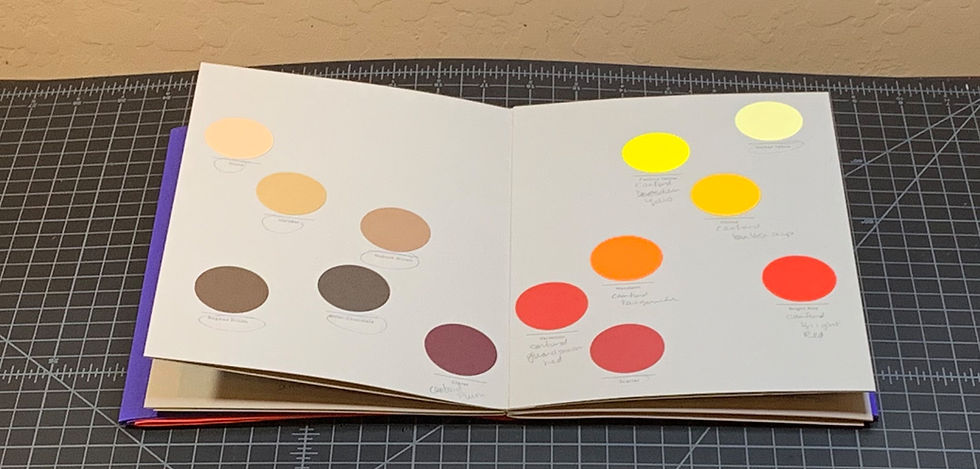
It is almost impossible to gauge paper color off of a monitor/online listing or even a printed (not physical) swatch book. I couldn’t find an actual swatch book for the different manufacturers (except Legion Colorplan, shown) so I had to manufacture my own. Luckily, I really enjoy doing organization things like this – I feel like I’m working but it is downtime for my creative brain.

First, I cut out tags of a sheet, using a large paper punch.
I then labelled the tag with the manufacturer, color name, and (sometimes) color number. Then I hole-punched the tag, and put it on a binder ring. Initially I had much fewer groupings, but with more shelves (!) I was able to break my color groupings down further for storage.
It took a day or two initially to create these swatches, but they are invaluable now. I can lay out the color next to the monitor to see approximately which base colors I want to start with. I can then select colors and see how they work next to each other. And finally, I put a post-it tag on the samples I’ve used up so that when I go to the store or online, I know which papers I need to buy more of.
Using the Colored Paper Samples to Make Selections for Artwork:
Inktober 2018 images to use for #Slowvember:

I start my projects by producing a rough digital color comp, not being too particular because I know the physical colors will change.
I also know that I will not achieve the exact colors in print – it is something I have to let go. What I do is to try to keep the colors consistent across a project, using the same red, etc. There are also some tricks in photography that will be discussed later. One advantage of this media is that I can also do somethings in the photography to tie the colors together – to make them look like they are existing in the same environment.
As I’m selecting the colors, I’m pairing them to other colors. I’m looking not only at the base color, but how does it play together with other color selections? Is it too dark in relation? Is it too cool, too warm? Etc.

With the above colors for “The Star Maiden”, the two initial deep reds seemed very similar. But when paired with the aqua color for the blue on which they would overlay, the deeper “Plum” was more of a contrast then I wanted.
I’m also thinking how I’m going to adjust the colors, with pastel or ink (to be discussed in later post). On both these pieces I’m also going to use more unusual materials like Tyvek and transparent overlays, so I’m thinking of how those materials will work with the colors.

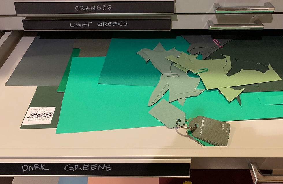
With how my studio is organized, I can then take the ring of color with appropriate tag selected to the corresponding drawer, and find the larger paper I'm looking for. I used to file the papers in a certain order (but that was madness!), but now I just try to keep smaller pieces on top, larger on the bottom.

These are the final color selections for “The Star Maiden”. I’m going a little darker, more vibrant on the color for the water background, because I know I want to play with overlays that will both lighten and desaturate the background paper. (And how much do I love that pull out shelf to lay the papers on?!)
These types of decisions can only come through making your own work and making mistakes. I can't tell you how to make these choices. And, sometimes, the mistakes are techniques you can use in other ways.
These are the final color selections for "The Spirit in the Bottle":


For “The Spirit in the Bottle”, I didn’t pull out a brown for the forest floor because I want to use Tyvek – I know it will give a textural effect and that I’ll have to ink it myself. I kept the swatches for a blue and a brown to use as a reference for the background colors.
This is a more limited palette than for “The Star Maiden” because I know that the accent colors are going to be added through ink rather than paper, forming the gilding on the bottle.
Colored Papers are NOT Colorfast!
ARCHIVAL TIP: colored art papers are notoriously NOT color-fast. I’ve bought sheets where the edges of the paper were a completely different tone from the middle just from how they were stored in the store and the ambient light from the window.
As I chose my papers for these projects, I unintentionally created an object lesson on this very point.

I had pulled out this blue for “The Star Maiden”. The swatch I had was a very muted color. However, the piece I now had was much more vibrant. Obviously, the old swatch had faded. Fortunately, I had enough of the faded sample (which was more my preference) for this piece. But I cut a new swatch from the newer paper so that I had a more accurate representation going forward.
Tomorrow’s post will discuss how I chose the skin tone on both images, because there are some interesting considerations and resources I’ve recently found.


Comments