
Adding Color to the Paper Sculpture: Darker Areas
This post is on the use of transparent inks: these are applied before embossing and shaping the paper as they are waterproof. Additional color is added after shaping through pastels – both these will be discussed in a future post.
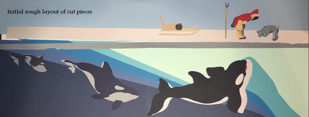
At this stage, I will usually roughly layout the pieces of paper I’ve cut and look for how they are working together on an abstract level. (This piece shows the abstract qualities well).
NOTE: It is perfectly fine NOT to add additional coloring to the paper. It gives it a much more graphic, poster quality. However, if I’m going for a more realistic approach, I add color for two reasons:
1) If I tried to make every color a different layer of paper, it would be come overwhelming (both in terms of work and visually). Think of a single feather – it can run a range of colors. So I use both different colors on separate pieces, and different colors on one piece.
2) I want to bolster the illusion that this is a real space – and I want the colors to relate to each other as if they are existing in the same light, etc. I can boost this by adding related colors to the various pieces, particularly in areas of shadow/highlights.
I use Inktense pencils primarily, with Dr. Martin’s Bombay Inks for larger areas. There are many people who also use copic markers (although these are NOT lightfast), or brush on inkpad colors. My preference is based on where I live – in the desert! Markers and ink pads dry out in less than 6 months for me, and it’s just not cost effective to keep replacing a library of colors. Inktense pencils (which also come in stick form) allow me to add color in small increments, and once they are spread/activated with water and dry, the colored area is now waterproof.
Colorizing with transparent inks is almost always going darker or just changing the color because of their nature – they’re transparent. (Ie., it’s harder to go lighter over something unless the medium is opaque). Sometimes though, you want to add darkness with the pastels also. I will do both.
Inks I do BEFORE the bas -relief manipulation techniques, because the inks are waterproof after they’ve been wetted. You can wet the pastels also, but if you need to manipulate the paper after applying pastel, it can be messy.
Transparent Inks:
As I look at the rough layouts of pieces, I make some judgment calls. For “The Star Maiden” (before image is shown at the end of the post) I think the green is much too “toothpaste-y”, the red vines need to have more dark areas, the blue background needs to be much darker, etc.
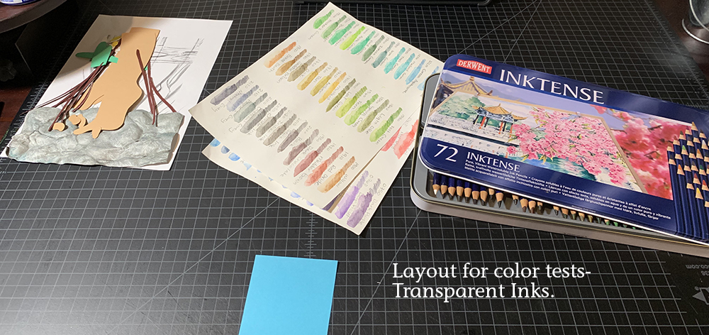
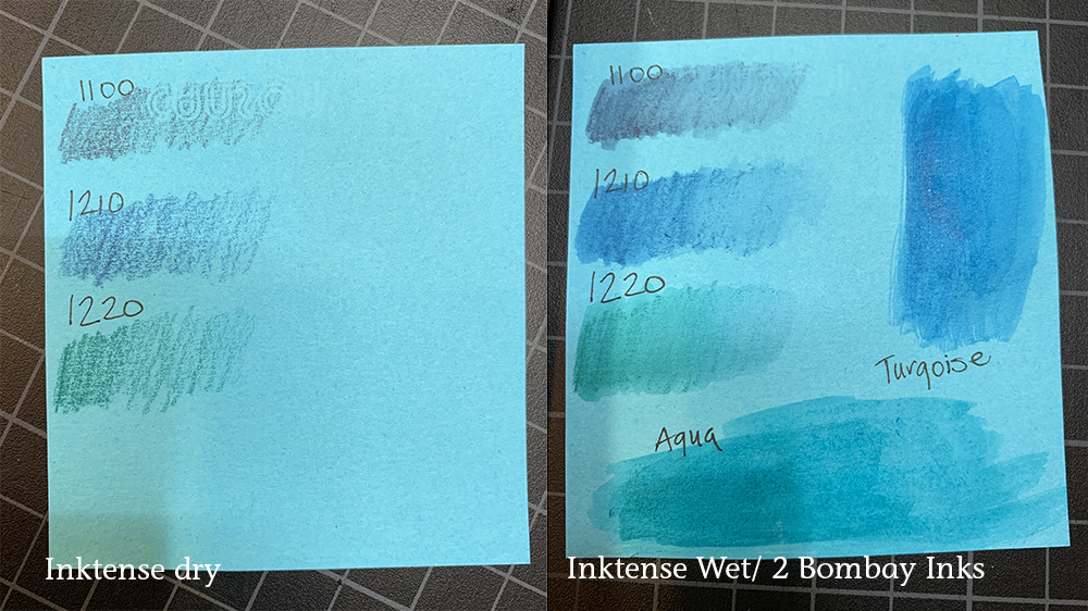
From the many pieces of scrap paper I end up with, I play with certain colors selected from my handy chart and see how they will work on the colored paper. I will do a gradient of shading and will sometimes overlap colors. I then add the water, working from less concentrated to more. I personally don’t choose to use water pens; I think I bought a bad set that I felt really didn’t let me control the water amounts. I have friends who love them though, so this is another option. Keep these “color charts” to test the pastels against your existing ink colors. These samples (and the others from each color) show me some consistent colors I can add across the colors to tie them together visually.
I have also found with inktense pencils that you only have one shot – it’s hard to layer colors after it's been wetted. I will try to go as concentrated as I want initially and if I’m going to blend two colors, I will do so in the dry stage. I will also try to smooth out the visible lines as I go – this can be an interesting effect to leave in, however.
As an aside, the inktense pencils did not work well on the Tyvek paper.
On the aqua background, I know it’s going to be a larger area, and I’m noticing the inktense is making the paper get a little scrubby (lifting up when wet). So I tried some of the bottled Bombay inks, and I think I’m going to use them instead
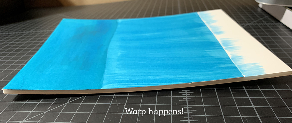
AAGGHH! Note: I generally use pastels in the background and haven’t run into this problem before. I did do transparent washes of the Bombay inks, and didn’t think about how they’d dry. And the background piece of foam core warped. At this point, I could either redo the background, since it’s hardly begun, or I can try to mount the piece to another backing board down the road. I think I’d better stick to pastels in the future, as it’s hard to weigh down the foam core with wet ink on top.

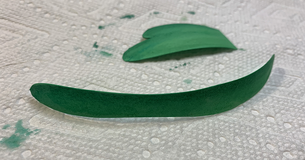
Sometimes, you don’t want to use the inktense pencils directly on the paper, but would rather have a less intense color. You can make an area of inktense on a piece of scrap paper and just transfer some color with the wetted brush, or "paint" the wetted brush on the pencil tip to lift some color. With the white lily flower leaves, I first colorized the red vines and then used a little residual color on the brush to give a faint shadow to the flower.
Lighting and photography can give a lot of play to your environment, but you still want to keep in mind where your light source would be in the image and think of your warm highlights/cool shadows (in this instance).
As you do the washes of the inks on the paper, you will notice the paper pieces warp. This is not a problem as we will be wetting and shaping the paper and will take the warping out.
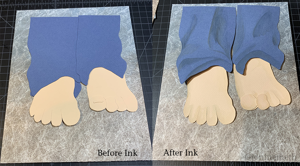
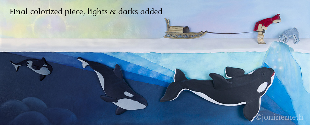
To the left are the BEFORE/AFTER of both pieces after adding ink. You will notice on “The Spirit in the Bottle” that there is little added coloring. I know that when we emboss and shape the folds on the pants, I will need to go back in to add shadows, but it’s a little tricky at the moment not really knowing where those folds will be.
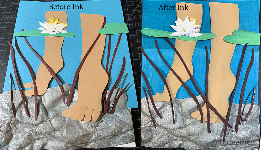
On “the Star Maiden” it should be obvious that even this first pass of colorizing has unified the pieces so that they are relating to each other more.